- 1. Adopt a Responsive Web Design Strategy
- 2. Check That Google Can Crawl All Your Resources
- 3. Serve The Same Content For Desktop And Mobile
- 4. Analyze Your Page Speed Using PageSpeed Insights
- 5. Optimize Core Web Vitals Scores
- 6. Format Content For Mobile Viewing
- 7. Eliminate Full-Screen Popups And Intrusive Interstitials
- 8. Check Your Structure Data Implementation
- 9. Review The Placement of Your Ads
- 10. Design Navigation Menus For Mobile Users
- Learn More About Mobile SEO
Optimizing your website for mobile users is critical for your website's success. For starters, Google is following a mobile-first indexing strategy, which means that they crawl and index your website's mobile version and not desktop, and equally important, the majority of users are now consuming content on mobile than any other device.
Mobile SEO is not different from general SEO. It includes a set of guidelines to improve the user experience on devices with smaller screens. If you want to improve your mobile rankings, our checklist includes everything you need to check and optimize.
1. Adopt a Responsive Web Design Strategy
The first step is to adopt a responsive web design strategy. A responsive design ensures that your website automatically adjusts its layout and content to fit any screen size, whether a desktop, tablet, or mobile phone.

This enhances the user experience by providing an easy-to-use website across all devices, and it's also good for SEO. Google recommends having a responsive design because it's easy to implement and maintain and uses a single URL and the same HTML across all devices. This makes it easier for Google to crawl, index, and understand your content.
If you already use a responsive design, move on to the next step.
2. Check That Google Can Crawl All Your Resources
The second check is to ensure that Google can access all your website resources, including CSS, images, and JavaScript. These elements help Google understand how your website functions and how it appears to users.
If Google can’t see these resources, it may misinterpret your site’s layout, content, or functionality, which could negatively impact your rankings.
For example, if your CSS is blocked, Google might not understand how your site is meant to be displayed, leading to poor user experience.
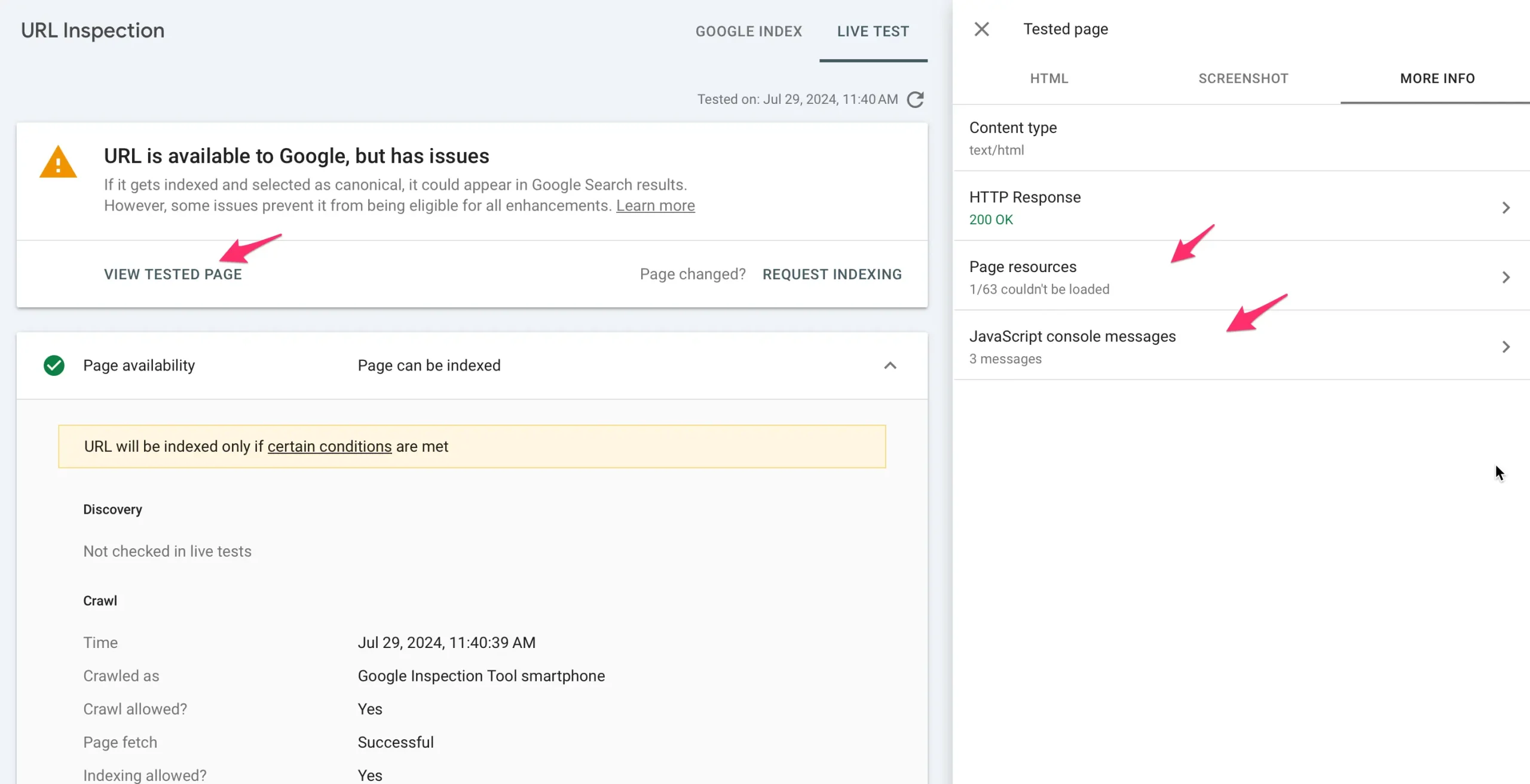
To ensure Google can crawl all your resources, follow these steps using the URL Inspection Tool in Google Search Console:
- Log in to Google Search Console and select your property.
- On the left-hand menu, click on “URL Inspection.”
- Enter the URL of the page you want to check in the search bar and press Enter.
- Click "View Crawled Page".
- Review the results under “More Info” to see if there are any issues. Look specifically for resources that are labeled as blocked or not loaded. If you find blocked resources, check your robots.txt file to see if they are being unintentionally blocked. Update it to allow Google to access these resources.
- Click the "Screenshot" tab and review how your webpage is rendered.
- Re-test the URL after making changes to ensure everything is accessible.
3. Serve The Same Content For Desktop And Mobile
One of the most critical mobile SEO factors is ensuring that your desktop and mobile websites have the same content. This is especially important if you maintain a separate version for your mobile website.
Serving different content on mobile and desktop can confuse search engines, leading to inconsistent indexing. Google uses mobile-first indexing, meaning it primarily looks at the mobile version of your site. If your mobile site has less content or is missing key elements compared to your desktop site, you risk losing visibility in search results.
To avoid this, ensure all important text, images, and other content are identical across both site versions. If you're using a responsive design, check that you're not hiding any important content through CSS.
4. Analyze Your Page Speed Using PageSpeed Insights
Your mobile website should load in less than 2.5 seconds on mobile. This is Google's general guideline, but it's also the minimum to keep your users happy.
Several studies over the years have shown that conversion rates decrease as website speed increases above the 3-second threshold.
As a first step, check your website speed using Page Speed Insights.
Scroll down to the "Diagnostics" part and get recommendations on how to improve your page speed.
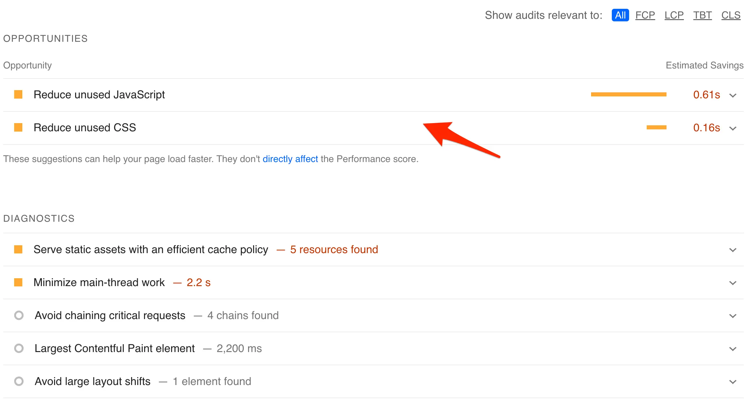
In the majority of cases, the most usual suspects that affect page speed are:
Unoptimized Images: Large, high-resolution images can significantly slow down your mobile web pages. Compress images using tools like Squoosh and convert them to speed-friendly formats like WebP to reduce file size without compromising quality.
Also, consider using responsive images to serve users on mobile images in the right size without wasting time downloading bigger images.
Render-Blocking JavaScript: Scripts that block rendering can delay page loading. Consider loading the scripts in the website's footer or asynchronously to prevent them from holding up the page rendering process. If this is too technical for your skills, you may need to hire a developer for this task.
Excessive CSS: Too many or poorly optimized CSS files can increase page load time. Minify your CSS, remove any unnecessary styles, and consider combining files where possible to reduce HTTP requests. If you're on WordPress, use the WP-Rocket plugin.
Server Response Time: Slow server response times can greatly impact your page speed. Consider using a content delivery network (CDN), or contact your hosting provider to upgrade your hosting plan to improve performance.
5. Optimize Core Web Vitals Scores
Besides measuring page speed, you should also check your core web vitals scores. Core Web Vitals is a set of metrics introduced by Google to help developers and website owners monitor and measure metrics that relate to the user experience.
- LCP (Largest Contentful Paint) measures the speed at which your website loads. The ideal value is less than 2.5 seconds.
- INP (Interaction to Next Paint) measures the time it takes for your website to respond to user interactions. The ideal value is less or equal to 200 milliseconds.
- CLS (Cumulative Layout Shift) measures your website's visual stability by tracking unexpected layout shifts. The ideal value is less than or equal to 0.1.
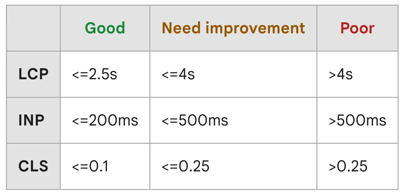
Since this is a technical SEO task, you should do the following:
- Check your Mobile Core Web Vitals Report in Google Search Console.
- Look for pages marked as 'poor URLs' or 'URLs need improvement'.
- Check which metrics fail and use Page Speed Insights to get recommendations on improving them.
In most cases, the tips outlined above for improving your page speed will also improve your core web vitals scores. If that's not the case, assign this task to a developer to make the necessary fixes.
6. Format Content For Mobile Viewing
A mobile-friendly design makes it easy for users to consume content on mobile devices. This means there are no horizontal scrollbars, and users can read the content without zoom-in.
To understand what changes you have to make on your website to improve the UX on mobile, assess your content by asking yourself these questions:
Is the text size large enough to read without zooming? Ensure your font size is at least 18px for easy readability on smaller screens.
Are paragraphs and sentences short and easy to scan? Break up long blocks of text into smaller paragraphs and use bullet points or numbered lists to make the content more digestible.
Is the content width optimized for small screens? Check that your content adjusts properly to fit within the screen width without requiring horizontal scrolling.
Are buttons and links easily clickable? Ensure your buttons and links are large enough and adequately spaced to prevent accidental clicks.
Are images and videos responsive? Ensure all visual content scales correctly on mobile devices without losing quality or breaking the layout.
7. Eliminate Full-Screen Popups And Intrusive Interstitials
When ranking webpages, Google uses several signals related to the user experience. One group of signals is known as the 'page experience'.
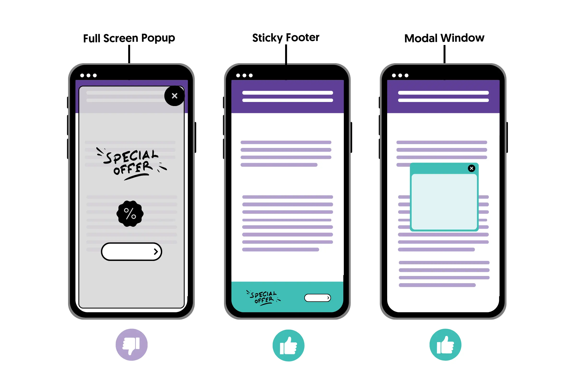
Page experience looks for the things we already discussed (like speed and core web vitals) but also for elements that distract users from accessing the page's main content, like full-screen popups.
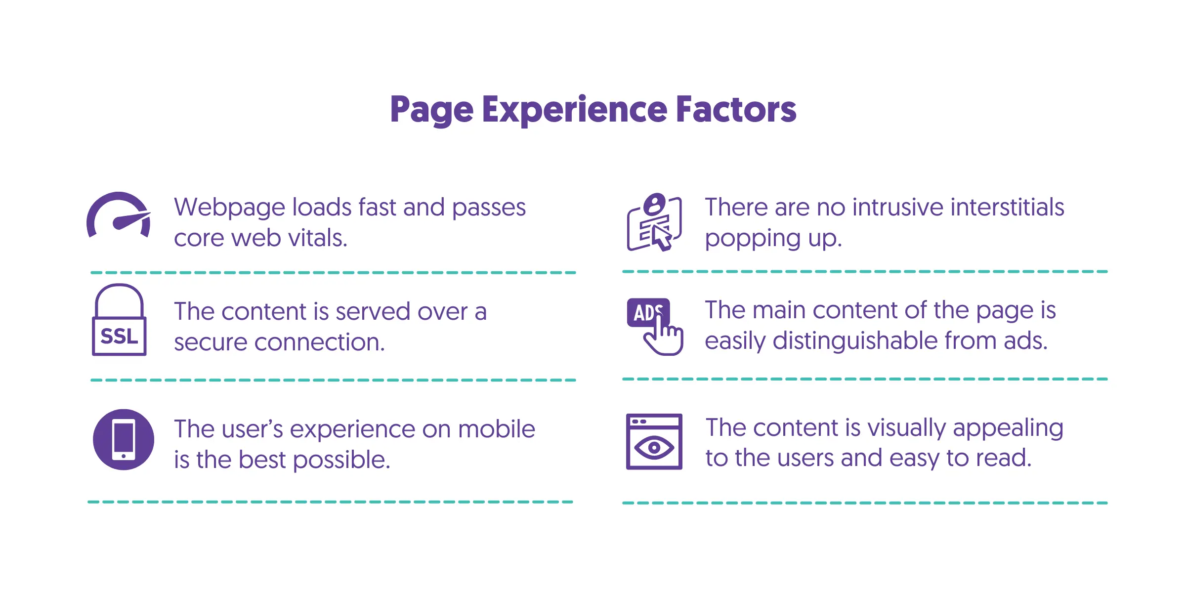
To avoid being penalized by a Google penalty, you must remove any popups covering the whole screen. Instead, you can use a sticky footer (like we do on our website) or a modal window with a clear, big, and visible close button.
8. Check Your Structure Data Implementation
Adding structured data to your content is not only beneficial for mobile SEO but is one of the best SEO practices. Structured data increases your chances of appearing in featured snippets, rich snippets, and other search features.
Structured data, often called schema markup, is a code you add to your website to help search engines understand the content better. When implemented correctly, it can significantly enhance your visibility in search results, particularly on mobile devices.
To add schema markup to your website:
- Identify the Relevant Schema Type: Determine which type of structured data fits your content. For example, if you have a blog, you might use Article schema, while an e-commerce site would benefit from Product schema.
- Generate the Schema Code: Use ChatGPT or a plugin to obtain the necessary JSON-LD code to add to your website.
- Add the Code to Your Website: Insert the generated code into the HTML of your web pages. Typically, this code is placed in the head section of the page.
- Test Your Markup: Use Google’s Rich Results Test to ensure your structured data is implemented correctly and to see if your content qualifies for rich results.
9. Review The Placement of Your Ads
Too many ads on your webpage, especially on mobile, is a bad SEO practice that can negatively impact your rankings.
As explained above, the placement, number, and type of ads are part of the page experience algorithm, and pages with distracting ads may suffer in search rankings.
To optimize your ad placement for mobile SEO:
Limit the Number of Ads: Ensure that the number of ads doesn’t overwhelm your content. A good rule of thumb is maintaining a clean and user-friendly layout where the content is the main focus.
Position Ads Strategically: Place ads in areas that don’t interrupt the user experience, such as between paragraphs or at the end of your content rather than at the top of the page.
Don't use sticky ads: Ads that appear in popups or follow the user as they scroll your content should not be used.
Test Ad Load Times: Ads can significantly slow down your site. Use tools like Google’s PageSpeed Insights to ensure your ads are not affecting your page load speed.
10. Design Navigation Menus For Mobile Users
Your website’s navigation should be intuitive and easy to use, especially on mobile devices with limited screen space.
To optimize your navigation menus for mobile:
Simplify Your Menu Structure: Limit the number of menu options to avoid overwhelming users. Consider using drop-down or expandable menus to keep things tidy.
Prioritize Important Pages: Place the most important pages at the top of your menu or make them easily accessible. This helps users quickly find what they’re looking for without excessive scrolling.
Use Mobile-Friendly Formats: Opt for a hamburger menu or sticky navigation bar, which are commonly used on mobile sites. These formats save space and improve usability. Visit our website on mobile to see a real example.
Ensure Tap-Friendly Links: Ensure your menu links are large enough to be tapped easily without accidentally clicking on adjacent links. This is crucial for providing a smooth user experience on touchscreens.
Learn More About Mobile SEO
Mobile SEO is not different from general SEO. To fully optimize your website, you need to apply all possible SEO practices, and these guides and courses will help you get started in the right direction.
